Showing posts with label Unit 59. Show all posts

Thursday, 30 March 2017

Portfolio slideshow 2

In  the lesson today I went and fixed the slideshow problem I mentioned on the previous blog where it just showed the pictures individually, instead of the slideshow format. I also added pictures on to the drawing section of the portfolio. I don't think I have anything else to add onto it for the time being but when I do find more stuff it will be added on.

When the link is in a normal format it doesn't allow the slideshow to work but when it is an unprotected script it does.

I wasn't able to do everything I wanted to do for example on the home page where the blue and black boxes are I wanted to make a collage, or a big group picture with the best of my works side by side in one environment. There was also over things I wanted to do like the email button takes you to my email but the computers don't allow that, and the software try's to kill my computer, so that will not be fixed for awhile, I also wished I could put more things on the portfolio section but there are parts that I just didn't have any images to put on them, so there empty for the time being but will have things put on them most likely on a later date.


Thursday, 23 March 2017

slideshow

In today's class I made the about me section of my website which I had but at the bottom of the home page. If you click the about button on the homepage it takes you to the bottom of the page, If you click it on any other page it take you to another page with the about me section in the center.


I also changed the background from read to a nice pattern that doesn't hurt the eyes.
On the portfolio section I added a slide show on the main portfolio section and the 3D modeling section. I put on the portfolio slideshow I put the map I made for the spatial storytelling game, and a couple of 3D models on it.On the 3D section slideshow I put almost all my 3D models on and made them all the same size, which distracted some of the images.

I came back later in the week to see the slideshow function had stopped working and showed the pictures separately and stacked one above the other, for the time being I'm going to leave it like this and sought the slideshow out at a later date.
Monday, 13 March 2017

Website 2

In today's lesson we did more work on the Portfolio, I planed to make it so the search bar would follow down the screen when you scrolled.
I couldn't do this because the coding we needed to use doesn't work very well with flex box and would mess things up and make it look a bit wired and not like the above design.(It stacked the links on top of each other) In the end I ditched the idea of  the search bar following when you scrolled so it just stayed where it is.

I also made it so when you select twitter in the drop down menu in contacts it takes you to my twitter, this however did cause problems and made it that if you selected anything that didn't have a link on it it would take you to the twitter which caused a bit of a problem because it would mess up if anyone was to do that. But we managed to fix, I missed a bit of coding and didn't close of a section properly so it would do what I said above, but after going through all the code I found where I went wrong and fixed it.

The final thing I did was Make a link on the about section of the search bar which takes you to the bottom of the page which will show the about me section with a picture and a short bio on what I do.
The outline of what my about me section will look like.
https://abbisands1.github.io/New-Portfolio/#link1

Thursday, 2 March 2017

Making a Portfolio part 1

In class today I started making my portfolio based on the sketch that I did at home.


The first thing I did was make a navigation bar which should link you to the Home, About, Portfolio,Blog, Contact.

On the contact section and Portfolio section of the navigation bar it drops down to show the choices It can take you too. 
The portfolio drop down menu.


I then added three parent sections with a margin top of 5 px for all of them and a margin 8 px bottom with 5 different sections with spaces between of 5 px in between each section.

Where the white Square is I added text which was put into a child div which was inside a parent div
the white box is called section_two_right and it has a paragraph in it that says click here for Portfolio. this has a class which I called click. In the css for section two right we made the font-size: 2 rem, and the position relative.

On the div class click in the css we made the position:absolute with a top of -50%, and transform: translateY  (-50%) which allowed it to look like this.

I also made it so when you click on the section in  the navigation bar that says blog it opens a new page and takes you to my blogger.


Thursday, 23 February 2017

research on designs for my portfolio

Yui Moreau

Retro game looking  

Christopher Lee
cartoon looking almost childish but Is aimed probably for all ages as it uses styles from shows that older people probably watched when they where younger.


Studio Airport
Just a simple design most people could pull of a portfolio that looks like this, but they make it unique for the own  cause.


Justin Maller
unique art style yet a simple layout making the work stand out more on the black background


Tuesday, 21 February 2017

Turtle and seagull

In today's lesson I made a seagull and turtle in 3D Studio Max and textured them.

I first started making the turtle which I made a cube and a rectangle, with the rectangle I copied it four more times so it could form the other limbs of the turtle, I put the cube in the center and then positioned the  rectangles around the cube so they would form the head, and legs. I then beveled the shapes so they would be pointed.
I then attached all the shapes together so they where the same shape. I then  turbo smoothed it so it would be rounded looking a bit more like a turtle.

After that I unwrapped the UVW map and flattened it so I could see all the parts that needed to be textured, after that I put the frame into Photoshop and used it as a template to texture the turtle.
I then saved it as a bitmap and applied it to the shape I made for the turtle.

For the Seagull  I made a rectangular shape which I extruded and beveled to create a shape that resemble a bird.
I then turbo smoothed it which rounded it up so it wasn't rectangular, and then went and made a texture for it Photoshop.

I then put the texture on the shape and it turned into something that could resemble a seagull( if you close your eyes and think it's a seagull)


Wednesday, 8 February 2017

Crate and sand texture

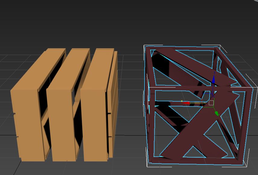
In today and yesterdays lesson I started to make a crate which we could duplicate and scatter around the island from the ship crash.

Plank of wood


edges of the crate
full crate


The frame and panels 

I also read a tutorial on how to make a sand texture on Photoshop 

I had to make a document which was 500 x 400 pixels in RGB with 72 dpi. We had to make the foreground the color #a8905e  and the background  #563d16. We then went on to filter, render and choose the option cloud which clouded the document.


I then went onto filter and added 10% noise with the distribution in uniform and the monochromatic box ticked.


After that we added a new layer which we applied filter render cloud to as well. We then added  radial blur which we got by going into filter>blur> radial blur, which we put the amount at 40, the blur method at zoom, and the quality at good. we then applied Bas relief. where we put the detail at 7, the smoothness at 15, and the light at the top. After that I applied Linear Dodge, I then adjusted the brightness to -144 and the contrast to -19.


Thursday, 2 February 2017

Responsive images

In the class we had 3 hours to make a site that had the same layout as one of the tree sites we had the choice of copying. I decided to copy the third choice.
Dwayne Helped me with this project because I was behind and I couldn't remember a lot of the stuff I needed to do, so he helped look at what we where doing and think logically.

we thought logically and decided to split the website into sections. 5 sections so we can go a step at a time. the entire website is a div, one section is a div parent, and the small sections in the div parent are called children div's.

I total there is one div, 5 parent divs, and 15 children div's.

We then added a navigation at the top with 3 different  nav classes with ul's and lists

My try at the website displayed above but with no pictures

https://abbisands1.github.io/abbie-flexbox/

Wednesday, 1 February 2017

Chest texturing

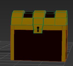
In the lesson today I made the textures for the chest in lesson today

I selected the section of the chest I was going to texture( base or lid) on 3D studio max  and I went onto the modify tab and put the unwrap uvw on the object, I then open the UV editor. I then selected it so I would a template of everything. I then rendered the uvw template and saved it as a bitmap.
I then opened the save in Photoshop  and duplicated the layer, on one of the layers I selected the entire layer and deleted I then added the  main color and added to the entire layer. I then went onto the layer with the UVW  on it and put it onto screen so only the green lines would show on the colored layer. I then added the colors to the sections of the chest, I then turned the UVW layer of and save the texture layer as a bitmap.

I then pressed M on 3D studio max on the selected object and selected bitmap diffuse and applied the texture on to the object.

Photoshop documents
Lid


Base
The reason this isn't as neat as the upper one is that I learnt that as long as the color you chose (yellow) doesn't go into sections you want it to you can be as messy as you want.


 3D studio model of chest

base


lid


together


This was the first Job I had to do on the production schedule.

Thursday, 29 September 2016

29/09/2016 Dwayne

session 1
we played about with blogger and gave the posts labels so everything could be easy to navigate to.

We then went onto re-design and move about the look of our blog when it is being viewed so it would look like we would want it to look like.

we designed an idea of what we wanted our blogger to look like on illustrator


I made my blog and changed the layout by adjusting the blog width  and the sidebar width I also changed the font and color so it is readable on the background I also changed the footer links and many other things color and how the text look so it could be seen clearer.


session 2
In this session we looked at other peoples portfolio so we could look at how we could design our portfolio.
Examples of other peoples portfolios that looked interesting

http://joycewang.com/

http://elenidebo.com/

http://www.aughtfive.com/

 we also designed how we wanted our portfolio to look like on illustrator as well

Session 3
In this session we went on to sublime and coded making our rough portfolio sites 
we went over some of the coding we did last week so we could remember.

coding section html and css

index.html